Sensei UX Review
Costarastrology Website UX Review
A scan-backed analysis of how Costarastrology performs across usability, visual clarity, and UX best practices. Use it as a reference for what to borrow, what to question, and what to test on your own site.
Sensei Score
67/100
green tier, scanned Jun 25, 2026Aesthetic
69Practices
62How Costarastrology looks
What the score says about Costarastrology
Overall Performance: A Visually Competent Page Undermined by Friction
Costarastrology's landing page scores 67/100—solidly mixed territory. The aesthetic layer (69) and functional layer (68) are nearly aligned, but practices (62) lag noticeably, indicating that foundational UX discipline is where the real gaps emerge. The page presents itself well enough to draw attention, but fails to guide visitors smoothly toward conversion or ensure accessibility for all users. For a consumer app in the astrology space, where brand personality and visual polish matter, the design does its job on the surface. The problem lies beneath: structural choices that frustrate users and exclude entire audiences.
Visual Presentation Works; Accessibility Does Not
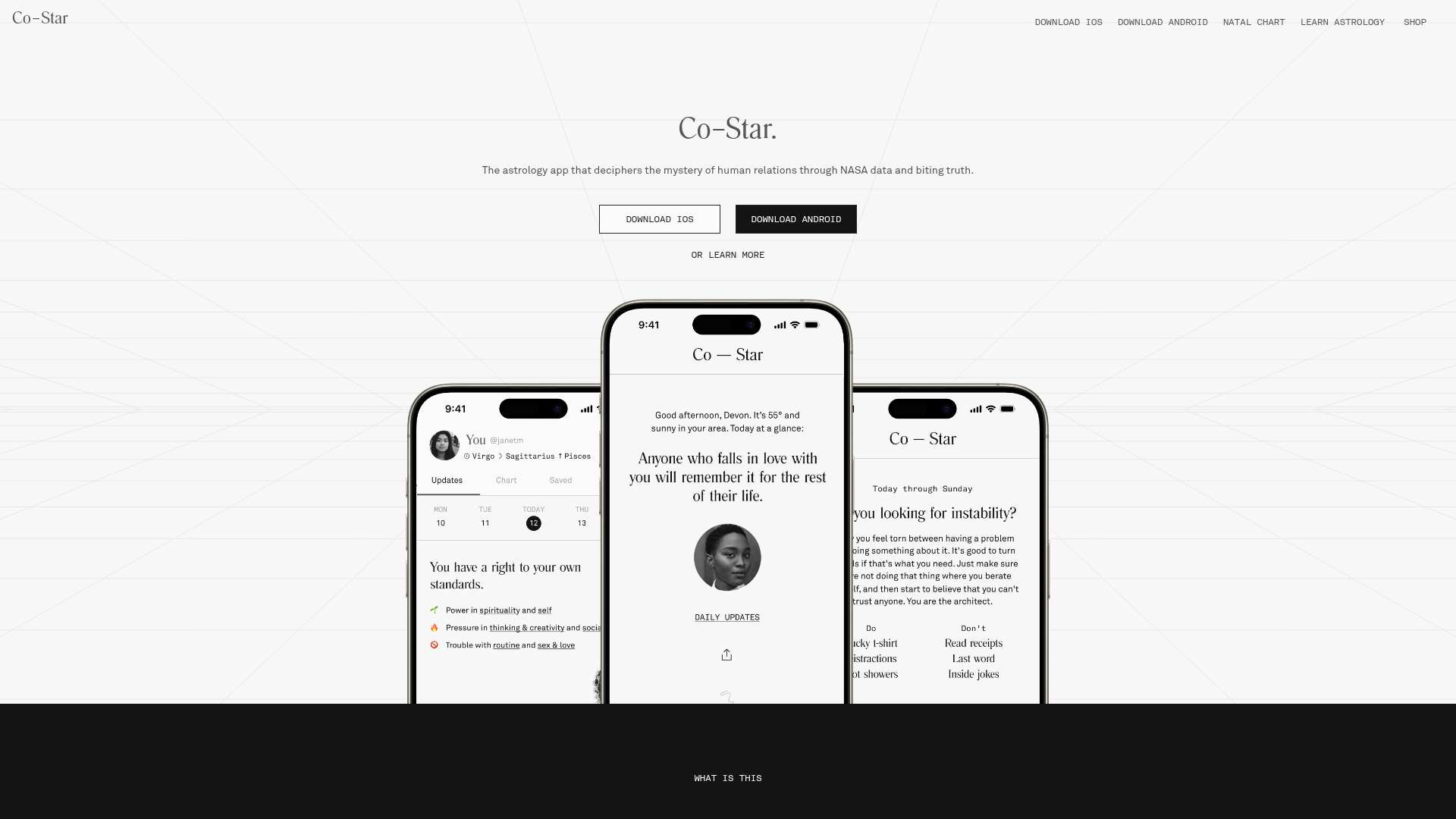
The aesthetic layer's 69-point score reflects a page that handles visual hierarchy and design language competently. The minimal hero headline ('Co–Star.') paired with supporting copy demonstrates confidence in brand recognition and positioning. This approach can work for established products, though the abstract value proposition—'deciphers the mystery of human relations through NASA data'—may not land immediately with new visitors unfamiliar with the brand.
However, visual competence masks a critical accessibility failure. All 16 images on the page lack alt text, and 5 form inputs are missing associated labels. These are not edge cases; they represent a complete barrier for screen reader users and a direct violation of WCAG 2.1 standards. For a product centered on personal data and self-discovery, excluding users with visual impairments is both an ethical and legal liability. This single issue likely depresses the practices score (62) more than any other factor.
CTA Overload and Form Friction Sabotage Conversion
The functional score of 68 reflects real problems in conversion design. The page presents 6+ competing primary CTAs above the fold—'DOWNLOAD iOS,' 'DOWNLOAD ANDROID,' 'Get your chart online,' plus repeated variations—creating choice paralysis rather than clarity. Hick's Law applies directly: more options increase decision time and error rates. A visitor landing on the page cannot immediately identify the single most important action.
The email signup form compounds this friction. It asks for birth date and time (three separate fields) before requesting an email address, reversing the typical conversion funnel. This demands personal data upfront without first establishing trust or value. The form also lacks risk reversal language—no statement of what the email will contain, how often it arrives, or why the visitor should trade their data. On mobile, the situation worsens: form inputs lack visible labels, input types are unclear, and required fields are not indicated. Touch targets are not confirmed to meet the 44px accessibility minimum.
Together, these choices create unnecessary friction at the moment of conversion. The form asks too much, too early, and the page offers too many escape routes.
Mobile Experience Neglected Despite Multi-Platform Focus
The page's emphasis on app downloads (iOS and Android are repeated multiple times) signals a mobile-first product strategy. Yet the mobile experience itself is undercooked. Form inputs lack proper optimization: no visible labels, unclear input types for date and time fields, and no indication of which fields are required. This is especially problematic for the birth date and time inputs, which are inherently complex on mobile and require clear affordances.
The repetition of download CTAs suggests the team is aware of mobile users but has not prioritized making the form experience mobile-native. A visitor on a phone faces the same choice paralysis and form friction as a desktop user, with the added burden of smaller screens and touch interaction.
Immediate Actions: Accessibility First, Then Conversion Clarity
The path forward is clear. First, add alt text to all 16 images and associate labels with all form inputs. This is non-negotiable and addresses the practices gap directly.
Second, reduce CTA clutter. Choose a single primary action above the fold—likely the app download, given the product's mobile focus—and demote or remove secondary options. This respects Hick's Law and clarifies intent.
Third, restructure the email signup form: request email first, then offer optional birth data for a more detailed horoscope. Add a clear value statement ('Get your personalized horoscope delivered weekly') and risk reversal ('Unsubscribe anytime'). Test mobile usability with real devices, ensuring input types are explicit and touch targets meet minimum standards.
These changes address the functional and practices layers without requiring a redesign. The aesthetic foundation is solid enough to support them.
Observed UX signals
functional / critical
Accessibility
All 16 images on the page lack alt text, and 5 form inputs are missing associated labels. This creates a complete barrier for screen reader users and violates WCAG 2.1 standards.
functional / major
Conversion Optimization
The email signup form ('looking 4 a sign? cast ur chart & get ur horoscope by email') asks for birth date and time (3 separate fields) before email, creating friction. The form also lacks risk reversal language or clear value statement about what the email will deliver.
functional / major
Focus & Hierarchy
The page has 6+ competing primary CTAs above the fold ('DOWNLOAD iOS', 'DOWNLOAD ANDROID', 'Get your chart online', 'Download iOS >', 'Download Android >'), creating choice paralysis. No single dominant action is visually prioritized.
functional / major
Mobile Experience
Form inputs lack proper mobile optimization: no visible labels, unclear input types (date/time fields), and no indication of required fields. Touch targets for form submission are not confirmed to meet 44px minimum.
functional / minor
Clarity
The hero headline 'Co–Star.' is minimal and relies entirely on the subheading and body copy to explain value. While this works for an established brand, the phrase 'deciphers the mystery of human relations through NASA data' is abstract and may not immediately resonate with new visitors.
aesthetic / major
Choice Reduction
Multiple competing CTAs above the fold (DOWNLOAD iOS, DOWNLOAD ANDROID, LEARN MORE, Get your chart online, Download iOS >, Download Android >) create decision paralysis and dilute conversion focus. The hero section repeats download options 3+ times within the first viewport, violating Hick's Law and reducing clarity of the primary action.
More UX reviews
Browse all →Benchmark your own page
Get the same layer-by-layer UX review for your homepage, pricing page, or product page.