Sensei UX Review
Champions4good Website UX Review
A scan-backed analysis of how Champions4good performs across usability, visual clarity, and UX best practices. Use it as a reference for what to borrow, what to question, and what to test on your own site.
Sensei Score
56/100
orange tier, scanned Jun 25, 2026Aesthetic
52Practices
51How Champions4good looks
What the score says about Champions4good
Overall Performance: A Site Caught Between Ambition and Clarity
Champions4good lands at 56/100—a mixed result that reflects a landing page with functional bones but significant friction in execution. The Functional layer scores highest at 63, suggesting the site has basic structural competence; however, Aesthetic (52) and Practices (51) lag considerably, indicating that visual presentation and conversion-focused design discipline are holding back what could be a stronger offering. For a membership platform asking visitors to commit €1,020–€3,960 annually, this gap between functional adequacy and aesthetic/strategic clarity is costly. The page attempts to position itself as a connector of athletes, entrepreneurs, and investors, but the execution obscures rather than illuminates that value.
What's Working: Functional Structure Exists, But Doesn't Translate to Trust
The Functional layer's 63-point score reflects that Champions4good has the basic scaffolding in place—navigation, content sections, and multiple pathways to conversion are present. The page does attempt to communicate membership tiers and pricing, which is essential transparency for a paid offering. However, this functional adequacy masks a critical weakness: the page fails to build the credibility signals necessary to justify premium pricing. Only one testimonial (Deborah Levi, Olympiasiegerin Bob-Zweier) appears above the fold, and there are no quantified social-proof elements—no member count, no company logos, no event attendance figures, no press mentions, and no trust badges. For a network-based business model, the absence of proof that the network actually exists and delivers value is a major missed opportunity. A visitor considering a €3,960 annual investment has no concrete evidence that the community is active, valuable, or worth joining.
Where It Breaks Down: Unclear Value Proposition and Conversion Paralysis
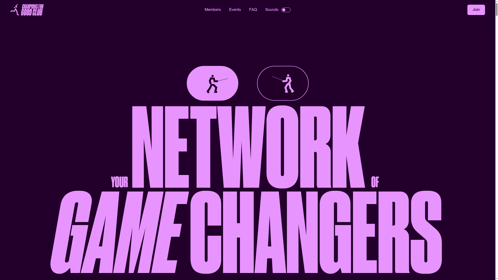
The critical failures cluster in clarity and decision-making friction. The hero headline—'YOUR NETWORK OF GAME CHANGERS'—appears twice and communicates no benefit. The actual value proposition ('Der Champions for Good Club verbindet Athlet-innen, Unternehmer-innen und Investor-innen') is buried in subtext rather than leading with transformation or outcome. A visitor cannot answer 'what is this for me?' within 5 seconds, violating basic UX principle for high-stakes pages.
Conversion design is further compromised by a confusing CTA landscape. 'JoinJoin' appears 12+ times throughout the page, with no clear distinction between joining a membership tier and booking a consultation. CTA copy is generic and offers no risk reversal—no mention of 'free consultation,' 'no commitment,' or 'cancel anytime.' For paid tiers, this absence of reassurance language directly increases abandonment risk.
Membership tier differentiation is also opaque. 'Booster' (€1,020/year) and 'Business' (€1,980/year) lack clear audience segmentation. The 'Partner' tier is labeled 'Individuell' (Individual) with no price listed, leaving visitors uncertain whether it is available or requires custom negotiation. This violates Hick's Law: too many similar options with unclear differences create decision paralysis rather than conversion.
The Aesthetic layer (52) compounds these problems. Typography hierarchy is severely compromised: 'YOUR NETWORK OFGAME CHANGERS' shows irregular spacing; 'No boringnetworking' vs 'No BoringNetworking' creates visual inconsistency. Multiple H2 and H3 headings lack visual distinction, making the page difficult to scan and understand.
Immediate Actions for the Team
Three changes would yield measurable improvement:
1. **Lead with a single, benefit-driven headline.** Replace the repeated 'YOUR NETWORK OF GAME CHANGERS' with a clear transformation statement (e.g., 'Connect with Europe's leading athletes, founders, and investors—and accelerate your impact'). Place this above the fold, in the primary visual hierarchy, with supporting subtext that answers 'what's in it for me?'
2. **Add quantified social proof immediately.** Introduce member count, company logos of notable members or partners, event attendance figures, or press mentions above the fold. Even one concrete number (e.g., '500+ members across 12 countries' or '50+ corporate partners') reduces perceived risk for premium pricing.
3. **Simplify and clarify the membership decision path.** Consolidate CTAs to a single primary action (e.g., 'Explore Membership Tiers'). Clearly differentiate tier names and target audiences (e.g., 'Booster: For emerging professionals' vs. 'Business: For established entrepreneurs'). Add risk-reversal copy to each tier ('30-day money-back guarantee' or 'Free consultation before purchase'). Remove or clarify the 'Individuell' tier with a price or a clear 'Contact us' CTA.
4. **Standardize typography and heading hierarchy.** Fix spacing inconsistencies, establish consistent capitalization rules, and ensure visual weight clearly distinguishes H1, H2, and H3. This alone will improve scannability and reduce cognitive load.
These changes address the gap between functional adequacy and aesthetic/strategic clarity, directly supporting the conversion goal for a high-commitment membership offering.
Observed UX signals
functional / critical
Clarity
Hero headline 'YOUR NETWORK OF GAME CHANGERS' is repeated twice and lacks benefit clarity. The value proposition is buried in subtext ('Der Champions for Good Club verbindet Athlet-innen, Unternehmer-innen und Investor-innen') rather than leading with the transformation or outcome. A visitor cannot quickly answer 'what is this for me?' within 5 seconds.
functional / major
Trust & Credibility
Only one testimonial is visible ('Deborah Levi, Olympiasiegerin Bob-Zweier'). No social proof above the fold regarding member count, company logos, or event attendance. No visible trust badges, certifications, or press mentions. The page lacks quantified credibility signals that would reduce friction for new members considering paid tiers (€1,020–€3,960/year).
functional / major
Focus & Hierarchy
Multiple competing CTAs labeled 'JoinJoin' appear 12+ times throughout the page (both as anchor links to #join and external Calendly links). The primary conversion path is unclear: users cannot distinguish between joining a specific membership tier vs. booking a general consultation. This violates Hick's Law and creates decision paralysis.
functional / major
Conversion Optimization
CTA copy is generic ('JoinJoin', 'Join') and does not communicate the next step or benefit. No risk reversal is present (e.g., 'Free consultation', 'No commitment', 'Cancel anytime'). For paid tiers (€1,020–€3,960/year), the absence of reassurance language increases perceived friction and abandonment risk.
functional / major
Clarity
Membership tier names and pricing structure are confusing. 'Booster' (€1,020/year) and 'Business' (€1,980/year) lack clear differentiation in target audience. The 'Partner' tier is labeled 'Individuell' (Individual) with no price, creating ambiguity about whether it is available or requires custom negotiation. A visitor cannot quickly determine which tier is right for them.
aesthetic / critical
Typography Hierarchy
Heading hierarchy is severely compromised by inconsistent capitalization, spacing, and visual weight. 'YOUR NETWORK OFGAME CHANGERS' appears twice with irregular spacing; 'No boringnetworking' vs 'No BoringNetworking' creates visual confusion. Multiple H2 and H3 headings lack clear visual distinction, making it difficult to scan the page structure and understand content relationships.
More UX reviews
Browse all →Benchmark your own page
Get the same layer-by-layer UX review for your homepage, pricing page, or product page.