Sensei UX Review
Aesop Website UX Review
A scan-backed analysis of how Aesop performs across usability, visual clarity, and UX best practices. Use it as a reference for what to borrow, what to question, and what to test on your own site.
Sensei Score
72/100
green tier, scanned Jul 10, 2026Aesthetic
75Practices
68How Aesop looks
What the score says about Aesop
Overview: Strong visual execution undermined by unclear value proposition
Aesop's landing page scores 72/100—a solid result that reflects genuine strengths in visual design and brand presentation, but also meaningful gaps in functional clarity and conversion strategy. The Aesthetic layer (75/100) is the page's strongest performer, suggesting the visual identity, imagery, and layout composition are well-executed. However, the Functional layer (73/100) and especially the Practices layer (68/100) reveal friction points that prevent the page from converting as effectively as its design quality might suggest. For a premium beauty brand, visual confidence alone is insufficient; visitors still need to understand what they're buying and why they should trust the brand enough to make a purchase decision.
What works: Visual design and brand presence create premium positioning
The Aesthetic score of 75/100 indicates that Aesop has successfully crafted a cohesive, high-quality visual experience. Product imagery, typography, and layout spacing appear intentional and polished—hallmarks of luxury brand positioning. The page leans heavily on visual storytelling and brand equity, which is a legitimate strategy for established premium brands with strong recognition. This aesthetic confidence is the page's primary asset and likely drives engagement among visitors already familiar with the Aesop name. The carousel structure and category-based discovery sections also demonstrate a thoughtful approach to organizing a broad product range without immediately overwhelming the viewer with a flat product grid.
Critical gap: Hero messaging fails to establish user benefit or urgency
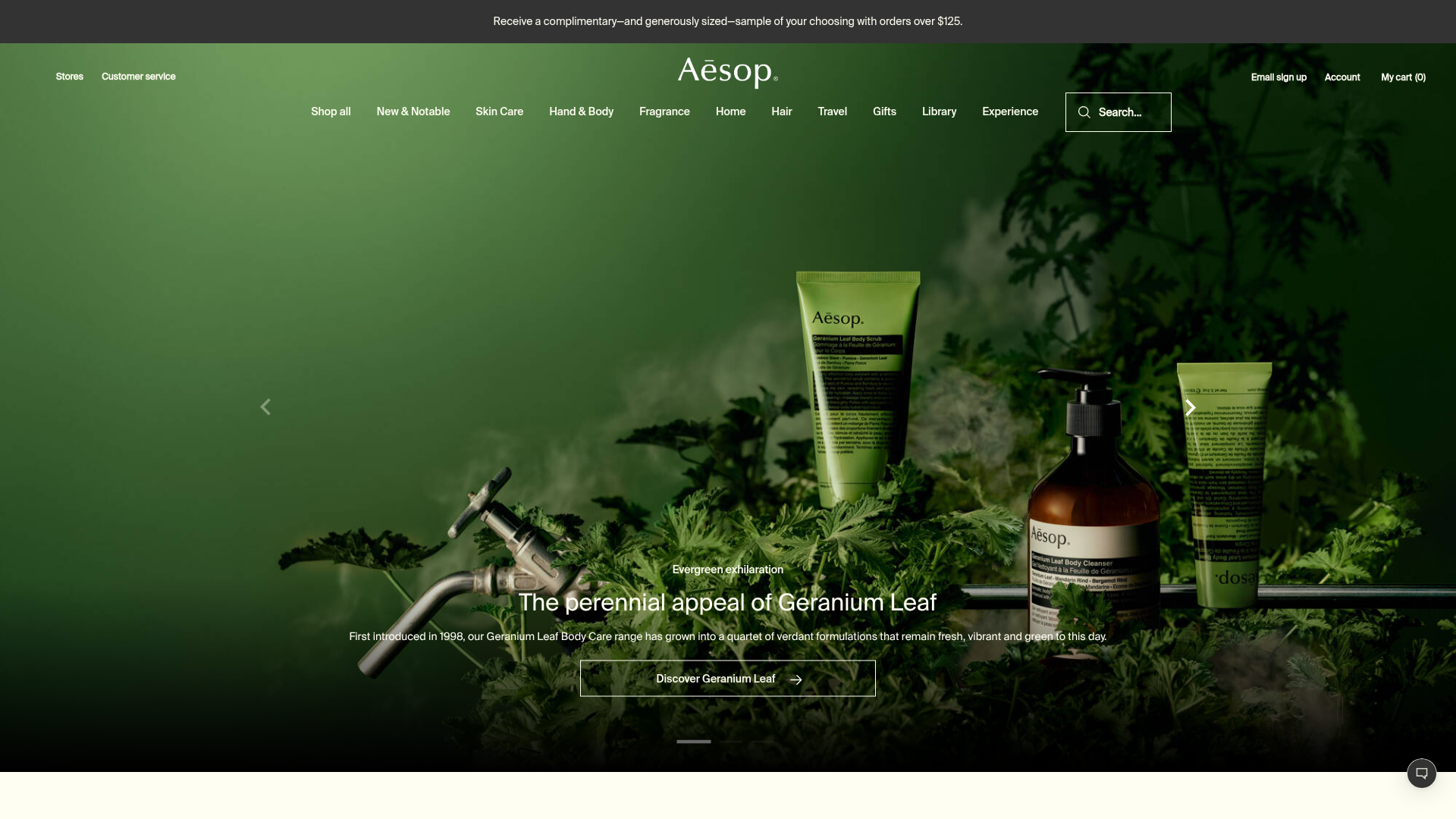
The landing page's most significant functional weakness is its hero headline: 'Plant-based and laboratory-made ingredients.' This is a feature-focused statement that describes *what* Aesop uses, not *why* a visitor should care. A first-time visitor cannot immediately answer the question: What do these products do for me? The headline prioritizes ingredient sourcing over user outcome, which assumes visitors already understand the brand's value. This assumption may hold for returning customers, but it creates a barrier for new visitors and abandons an opportunity to establish relevance within the critical first few seconds of the page experience.
Compounding this issue is the complete absence of social proof above the fold. No customer testimonials, ratings, press mentions, certifications, or trust indicators are visible. For a premium brand, this strategy can work if the visual execution and brand recognition are strong enough to carry the credibility burden alone. Aesop's aesthetic score suggests this is partially true, but the lack of explicit credibility signals—such as 'Trusted by X customers' or third-party certifications—leaves the page vulnerable to skepticism, especially from price-sensitive or unfamiliar visitors.
Conversion friction: Generic CTAs and competing navigation paths dilute intent
The Practices layer scores lowest at 68/100, primarily due to two interconnected issues. First, primary CTAs across the page are generic and benefit-agnostic: 'Discover Geranium Leaf,' 'Discover Fragrance,' 'Find your regimen,' and 'Browse by category.' These lack specificity, urgency, or outcome language. A visitor clicking 'Discover Fragrance' has no clear expectation of what happens next or what value they'll receive. Compare this to outcome-driven language like 'Find your signature scent' or 'Shop fragrance sets' and the difference in clarity becomes evident.
Second, the page presents excessive navigation and discovery paths above the fold, creating cognitive overload. The hero carousel alone offers three distinct entry points, and the category browse section immediately below adds eight more options. This abundance of choice, while visually organized, dilutes the primary conversion path and forces visitors to make a decision about *how* to explore rather than *why* they should explore. Additionally, product pricing and purchase CTAs ('Add all to cart') lack risk-reversal messaging. No visible mention of free returns, satisfaction guarantees, or other objection-handling copy appears near pricing, which is a missed opportunity to reduce purchase friction for first-time buyers in the premium segment.
Secondary issues: Mobile optimization and accessibility gaps
Two smaller but actionable issues emerged in the scan. The hero carousel slides are 1904px wide, indicating a desktop-first design approach. On mobile devices, this may trigger layout reflow or require horizontal scrolling, degrading the experience on a critical segment of traffic. The page data does not confirm mobile-optimized breakpoints or properly-sized touch targets for carousel navigation, suggesting this area warrants testing and refinement.
Accessibility also shows a gap: at least one input field (likely the search field) is missing a proper label element. Placeholder text alone does not meet WCAG 2.1 requirements; screen reader users will not have a clear label for the field. This is a straightforward fix—adding a hidden or visible label—but it reflects a broader accessibility review that should extend beyond this single field.
**Actionable takeaway:** Aesop's page has strong visual foundations but needs functional clarity to convert effectively. Reframe the hero headline to lead with user benefit ('Skincare that works with your skin' or similar), add a single, outcome-driven primary CTA to the hero, and introduce at least one credibility signal above the fold. Simultaneously, audit the navigation architecture to identify a single primary discovery path, reducing the cognitive load of competing options. These changes would leverage the page's aesthetic strength while addressing the functional gaps that currently limit conversion potential.
Observed UX signals
functional / major
Clarity
Hero headline 'Plant-based and laboratory-made ingredients' is feature-focused and abstract. It does not communicate the primary benefit or what Aesop products do for the user. A visitor cannot immediately understand why they should care about this page.
functional / major
TrustCredibility
No visible social proof, customer testimonials, ratings, or trust badges above the fold. The page relies entirely on brand name and product imagery. For a premium brand, this works if the visual execution is flawless, but there is no explicit credibility signal (e.g., 'Trusted by X customers,' press mentions, certifications, or user reviews).
functional / major
ConversionOptimization
Primary CTAs are generic and benefit-agnostic: 'Discover Geranium Leaf,' 'Discover Fragrance,' 'Find your regimen.' These lack urgency, specificity, or clear outcome language. The 'Add all to cart' buttons on curated sets are functional but do not address objections (e.g., no risk reversal, no mention of free returns or satisfaction guarantee visible near pricing).
functional / minor
MobileExperience
Carousel slides (hero section) are 1904px wide, suggesting desktop-first design. On mobile, this may cause layout reflow issues or require horizontal scrolling. The page data does not confirm mobile-optimized breakpoints or touch-target sizing for the carousel navigation.
functional / minor
Accessibility
One input field is missing a label (detected in accessibility indicators). This is likely the search field ('Search...' placeholder text visible in content). Placeholder text alone does not satisfy WCAG 2.1 label requirements; a hidden or visible label is required for screen reader users.
aesthetic / major
Choice Reduction
The page presents excessive navigation and discovery paths above the fold. Multiple competing CTAs ('Discover Geranium Leaf', 'Discover Fragrance', 'Discover more', 'Find your regimen', 'Browse by category') create cognitive load and dilute the primary conversion path. The carousel alone offers 3 distinct entry points, and the category browse section adds 8 more options immediately below.
More UX reviews
Browse all →Benchmark your own page
Get the same layer-by-layer UX review for your homepage, pricing page, or product page.